
The accent wall had a good run. For over a decade, one bold surface anchored bedroom design while everything else stayed safely neutral. But that formula created a problem most people never noticed: it fragmented the room. Every white baseboard and pale ceiling line drew your eye to edges instead of atmosphere.
Color drenching flips that approach entirely. Instead of highlighting one wall, you paint every surface — walls, ceiling, trim, doors, window frames — in a single cohesive color. The room stops reading as a collection of planes and starts feeling like one continuous space. That shift changes how a bedroom looks, how it feels, and how well you actually rest in it.

What Color Drenching Actually Means (and What It Doesn’t)
Most people hear “paint everything the same color” and picture a claustrophobic box. That’s not what this is. Color drenching removes the visual breaks that standard painting creates. The white ceiling line. The contrasting baseboard. The door frame that jolts you out of the room’s mood every time you glance at it.
When those breaks disappear, something interesting happens. Your eye stops tracking edges and transitions. You start noticing texture, light, and shape instead. The grain of a linen curtain. The way afternoon sun pools in a corner. The silhouette of furniture against a tonal wall.
This is the part most design advice glosses over. Color drenching isn’t really about the color itself. It’s about removing the visual noise that color contrast was creating all along.
Why Bedrooms Are the Best Room to Drench First
Living rooms serve guests, conversations, and competing activities. Bedrooms have one job: rest. That single purpose makes them the ideal candidate for full-color saturation.
It eliminates visual scanning. Standard white trim and contrasting ceilings create sharp horizontal lines your eye follows instinctively. In a drenched bedroom, those lines vanish. Your gaze settles instead of darting from surface to surface. For a room built around sleep, that matters more than any color choice.
It creates a cocooning sensation. Painting the ceiling the same shade as the walls wraps the room around you. The space feels like it’s holding you rather than just surrounding you. That distinction sounds subtle on paper. In person, the difference is immediate.
It can make a small bedroom feel larger. This surprises people. The common assumption is that dark or uniform colors shrink a room. In practice, the opposite often happens. Visible edges and surface transitions are what define boundaries. Remove those transitions, and walls blur into ceiling. A small room stops reading as a box and starts reading as a space.
2026 Color Palettes Built for Full-Room Drenching
Early color drenching leaned hard into dark jewel tones. Dramatic at first sight, sure. But livable over six months? Not for everyone. The palettes gaining ground in 2026 skew toward shades you can wake up in comfortably — not just fall asleep to.
Grounding Earth Tones
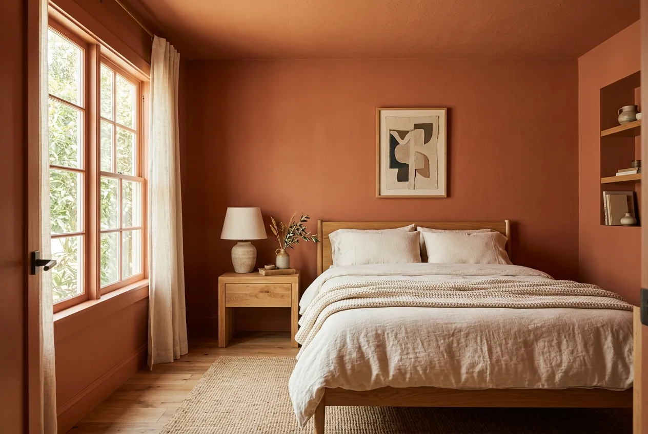
Warm terracotta, rich chocolate brown, and muted clay are leading the shift right now. These pigments absorb light gently rather than bouncing it around the room. They pair naturally with timber furniture, rattan details, and woven textiles without competing for attention.
One thing to watch: earth tones with pink or orange undertones react strongly to different light sources. A shade that looks warm and grounded under afternoon sun can turn flat and muddy under cool LED overhead lights. This happens with any paint, but drenching amplifies the effect because the color covers every surface in your field of vision. Test under both natural and artificial light before you commit.
Deep Shades for Restful Evenings
Forest green, midnight navy, and rich burgundy still belong in this conversation. These colors work especially well in bedrooms with limited natural light — which sounds counterintuitive until you see it in person.
Deep shades absorb and soften artificial light beautifully. A navy-drenched bedroom under warm lamp light feels enclosed in the best way — quiet, private, separate from the rest of the house. The trade-off is mornings. Very dark rooms resist the gradual brightness that helps you wake up naturally. If you’re a slow riser, think about how the room functions at 7 AM, not just 10 PM.
Soft Muted Tones for Brighter Spaces
Dusty sage, warm stone, and muted lavender suit bedrooms with generous windows or a pared-back furniture layout. These tones deliver the cocooning effect while keeping the room open and airy.
Sage green has surged in popularity for a specific reason. It reads as both calming and visually interesting — enough character to feel intentional, but not so bold it demands constant attention. Warm beige works too, but it walks a fine line between “considered neutral” and “just beige.” If you go that route, look for versions with a slight yellow or pink undertone to keep it from falling flat.
Why Paint Sheens Matter More Than the Color You Pick
Here’s what most people overlook entirely. You’ve chosen the perfect shade. You’ve committed to drenching every surface. But if you use the same paint finish everywhere, the room will look flat. Not calm-flat. Unfinished-flat.
The fix is straightforward: same color, different sheens on different surfaces.
- Ceilings get a flat or matte finish. This reduces overhead light reflection and hides the minor imperfections every ceiling develops over time.
- Walls get an eggshell or low-sheen finish. It’s durable, easy to wipe down, and diffuses light with a soft warmth that pure matte can’t match.
- Trim, baseboards, and doors get satin or semi-gloss. The slight sheen picks up ambient light and quietly highlights moldings, panel edges, and frame lines — without breaking the color envelope.
This sheen variation creates depth your eye perceives but your conscious mind doesn’t register. It’s the difference between a room that looks “painted one color” and a room that feels designed.
Double Drenching: Adding Depth with Tonal Shifts
If standard color drenching is the foundation, double drenching is the refinement gaining traction in 2026. Instead of one exact paint code on every surface, you select two closely related tones from the same color family.
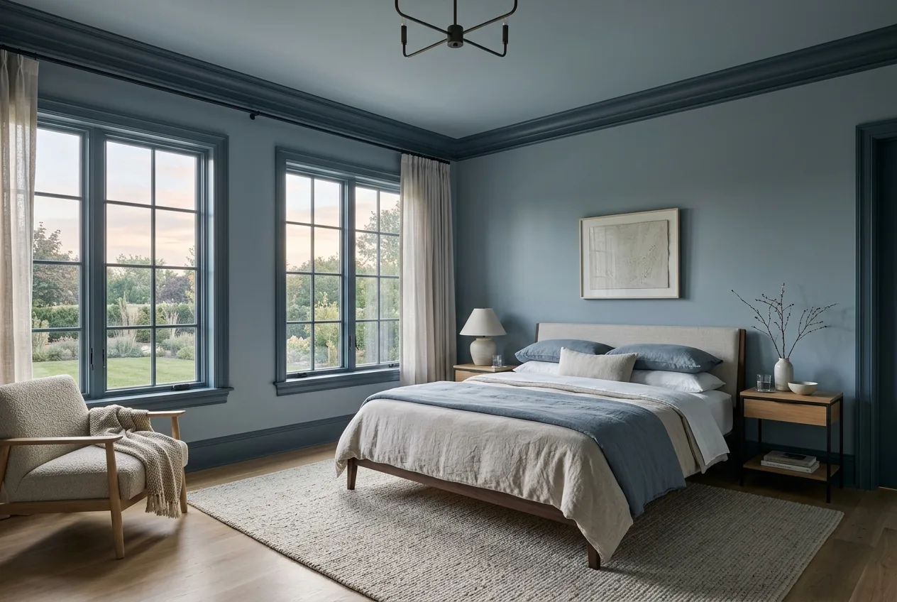
The classic pairing: deep slate blue on all woodwork with a slightly lighter dusk blue on walls and ceiling. The colors sit close enough to preserve the cocooning envelope, but the subtle shift adds a layer of dimension. Your brain reads it as one immersive color experience with just enough variation to keep things alive.
Paint brands like Little Greene and Farrow & Ball group their colors into tonal families designed for exactly this technique. If you’re not sure which shades pair well, start with those curated groupings rather than eyeballing matches from a fan deck. The margin between “harmonious pairing” and “two separate paint jobs” is narrower than most people expect.
Mistakes That Undermine the Whole Effect
- Leaving the ceiling white. This is the most common error and the most damaging. A white ceiling in a drenched room doesn’t just break the illusion — it reverses it. The white surface hovers visually above the colored walls, making the ceiling feel lower rather than higher. If you commit to drenching, the ceiling comes too. No exceptions.
- Ignoring how light shifts the color throughout the day. A saturated color on every surface amplifies lighting changes far more than a standard paint job. That terracotta that looked warm at 3 PM can read as flat and muddy under overhead LEDs at night. Test physical swatches on at least two different walls. Check them at morning, afternoon, and evening light before you buy gallons.
- Using the same sheen on every surface. Same color plus same finish on walls, trim, and ceiling flattens all architectural depth. The room looks like a first coat rather than a finished design. Vary your sheens deliberately.
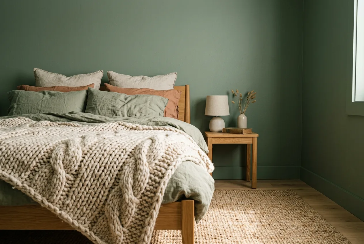
- Forgetting about texture. When every surface shares one shade, the room needs tactile variety to stay interesting. Layer linen bedding, a chunky knit throw, velvet cushions, and a woven rug. These textures do the visual work that contrasting paint used to do. Skip them, and a drenched room starts feeling monotonous within weeks.
- Not planning the doorway transition. This is the hidden pitfall almost nobody discusses. Your bedroom is drenched in deep sage. You open the door. The hallway is bright white. That hard color break at the threshold undermines the immersive feeling every time you walk through. Think about what colors border the room. A gradual tonal shift into the hallway — or at least a mid-tone connector — makes the whole scheme feel intentional rather than isolated.
What Actually Happens When You Live in a Drenched Room
The part nobody tells you: the novelty of a drenched bedroom fades within about a week. You stop noticing the color entirely. That sounds like a failure. It’s actually the whole point.
When you stop seeing the walls, you start seeing everything else. The texture of your bedding. How light moves through the room across the day. The shape of a lamp, the weight of a curtain. A well-drenched room becomes a backdrop rather than a statement. For a bedroom — a place built for rest, not display — that’s exactly right.
The other thing worth knowing: once you live with one drenched room, the standard-painted rooms in your house start looking unfinished. The bathroom with its white ceiling suddenly feels disjointed. The guest room looks like it never got past the first step. Color drenching has a way of spreading through a home once it starts.
If you’re weighing whether to try it, start with the bedroom. It’s the lowest-risk room because guests rarely see it, and the highest-reward room because you spend more passive hours there than anywhere else. Pick a shade you already know you like. Vary your finishes. Paint the ceiling. Commit fully, because half-measures just look like mistakes.
