
Most people assume a luxury bathroom starts at the tile showroom. It doesn’t. It starts at the drawing table — or, more accurately, at the moment someone decides to treat every surface as an architectural decision rather than a line item to fill cheaply and quickly.
Standard ceramic subway tile, off-the-shelf porcelain, budget stone-look planks — any of these can look genuinely high-end when the layout, grout, and edge details are handled with intention. The material is almost never the problem. The execution usually is.
Here is what actually separates a bathroom that photographs like a boutique hotel from one that reads as builder-grade the moment you walk in.
Tile Layouts That Signal a Designer Made Decisions Here
The horizontal running bond — tiles staggered at the halfway point, row after row — is the default setting on every builder-grade bathroom in the country. It is not inherently bad. It is just invisible. It communicates nothing. When you change the layout, you immediately signal that someone thought about this room.
Three layouts do this most effectively:
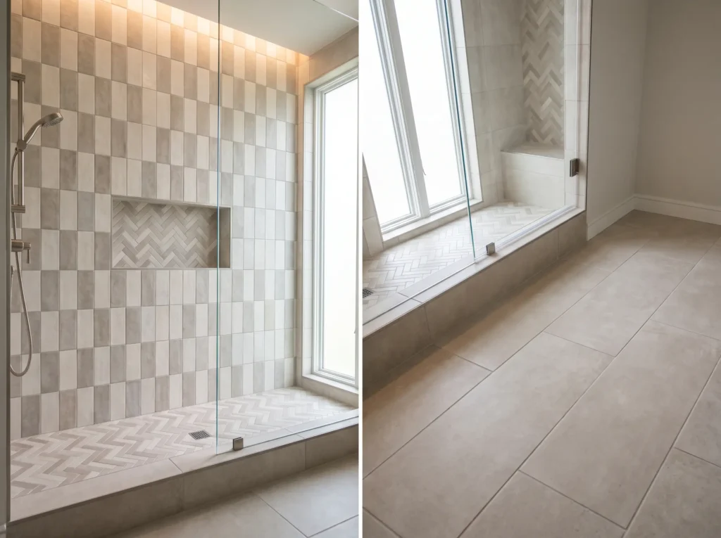
- Vertical stacked bond: Rectangular tiles aligned directly above one another in clean vertical columns. The eye follows those uninterrupted lines upward. In a compact shower stall or a narrow powder room, this single change adds the perception of height without touching the ceiling height itself.
- Herringbone: Tiles set at forty-five-degree angles in a repeating V. It introduces real movement and depth to flat walls. It also requires precise cutting and a higher skill level to execute cleanly — which is exactly why it reads as curated rather than automatic. Use it on a shower feature wall or as a floor inset and it carries the whole room.
- One-third offset: If you want a brick pattern but not the standard half-tile stagger, a one-third offset creates a softer, more intentional rhythm. It is especially useful for longer rectangular formats, where the standard fifty-percent offset tends to exaggerate any natural warpage in the tile — more on that shortly.
The layout decision costs nothing extra in materials. It may add modest labor time. The visual return is disproportionate.
Grout Is Not an Afterthought — It Is the Frame Around Every Tile
Walk into most bathrooms and the grout is the first thing that ages the space. White tile with dark grout that has gone gray. Large joints that make the wall look gridded rather than surfaced. This is where a significant amount of the “cheap” feeling actually comes from, and it is one of the easiest things to address before installation starts.
Tone-on-Tone Matching for a Monolithic Look
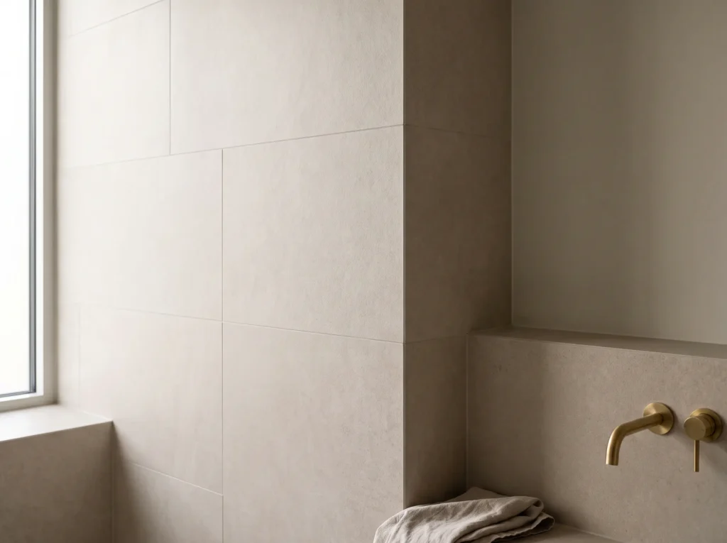
Matching your grout color closely to your tile body is the single fastest way to make a standard tile look like a continuous plane of stone. The grid disappears. What replaces it is a calm, uninterrupted surface that reads the way large-format natural stone reads — quietly expensive.
High-contrast grout is a deliberate style choice that can work beautifully in the right context. But if the goal is a timeless, spa-like atmosphere rather than graphic geometry, tone-on-tone is almost always the stronger call. It also has a practical benefit: minor color variation in the tile body becomes far less visible when the grout is not drawing a sharp border around every individual piece.
Narrow Joints and Rectified Tiles
Standard tiles are manufactured with slight dimensional variation — edges are not perfectly straight or squared. To accommodate this, installers use wider grout joints, typically three-sixteenths of an inch or more. The wider the joint, the more the surface reads as individual tiles rather than a unified plane.
Rectified tiles solve this. They are mechanically cut after firing, which produces genuinely square, consistent edges. With rectified tile, a skilled installer can use joints as narrow as one-sixteenth of an inch. The result is a razor-thin grout line that most people associate with premium imported stone or large-format porcelain slabs — and it is achievable with mid-range material when the tile spec is right.
Ask your supplier specifically whether the tiles you are considering are rectified. It is not always prominently labeled.
Edge Details: Where Most Bathrooms Give Themselves Away
The most common place a budget bathroom reveals itself is not the tile body. It is the edges — the point where the tile terminates at a corner, wraps around a niche, or meets a window reveal. Plastic bullnose caps and metal J-trim in a finish that does not match anything else in the room are instant signals that someone made the cheapest available choice.
There are three ways to handle this better, in order of refinement:
Mitered Outside Corners
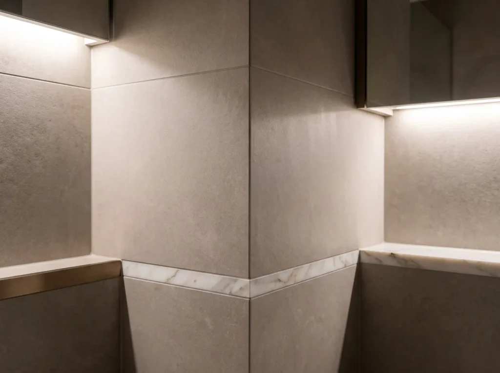
A mitered edge is exactly what it sounds like — both tiles meeting at a corner are cut at forty-five degrees, so when they are joined, the surface appears to wrap continuously around the corner rather than two separate pieces meeting. No trim. No cap. No exposed raw edge. The tile looks like a folded block of solid material.
This requires an experienced installer with a high-precision wet saw, and not every material miters cleanly — very thick stone or highly textured surfaces can be difficult. But on porcelain, ceramic, and most natural stone, a well-executed miter is the most refined corner finish available at any price point.
Low-Profile Metal Profiles
Where mitering is not practical — due to material thickness, installer capability, or durability concerns in high-traffic areas — a low-profile metal profile is a clean alternative. The key is finish selection. A metal edge in a finish that harmonizes with your plumbing fixtures (brushed nickel, matte black, unlacquered brass) reads as a deliberate design detail. A generic chrome J-trim that does not match anything reads as a workaround.
Use metal profiles on niche edges and exposed wainscoting terminations where they are visible at close range. At those distances, the finish selection matters more than people expect.
Marble Pencil Liners as Horizontal Datum Lines
For transitional and traditional bathrooms, a marble pencil liner running as a horizontal band across a tiled wall does something that is hard to achieve any other way — it introduces authentic stone texture without committing to a full stone installation. Running a pencil liner at wainscoting height, or as a visual break between field tile and a contrasting accent material, creates a grounding line the eye follows naturally across the room.
It is a small element that carries significant visual weight. Real stone, even in a one-inch trim profile, has a texture and dimensional variation that ceramic cannot replicate. That is the point.
Built-In Architecture: Ledges and Full-Height Surfaces
The difference between a bathroom that feels designed and one that feels assembled is usually whether the tile and the room’s structure are working together or simply coexisting. Built-in elements — when they are integrated into the tile plan from the beginning rather than added as an afterthought — are what push a bathroom into genuinely custom territory.
Continuous Shower Ledges Instead of Niches
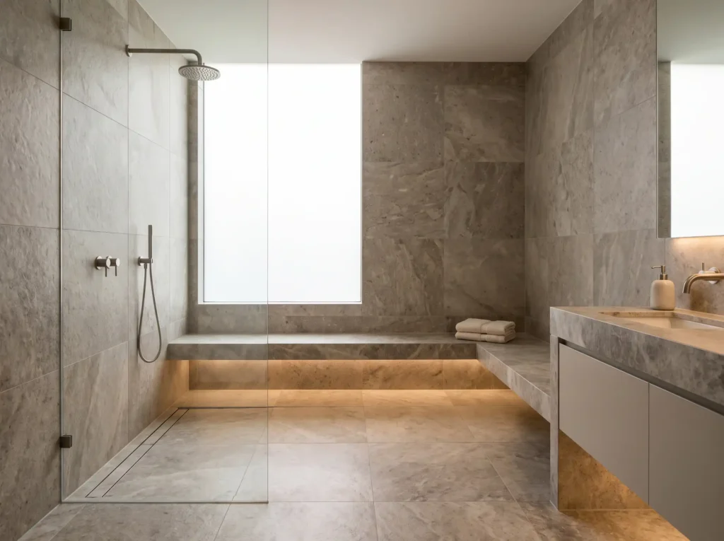
A recessed niche is a practical solution. It works. But it also tends to become a visual focal point of clutter — assorted shampoo bottles, mismatched containers, whatever accumulates in a shower over six months. High-end design has largely shifted toward the continuous ledge: a framed half-wall that runs the full length of one shower wall at a consistent height.
The detail that makes this element look truly expensive is what happens at the top. Capping a ledge with a solid slab of stone — ideally the same material as the vanity countertop — eliminates the grout line at the horizontal surface where water tends to pool. A continuous stone cap, properly sealed, is more durable than a tiled top and more visually refined. It also creates a material through-line that ties the countertop and shower together as a single compositional decision.
Floor-to-Ceiling Tile and Surface Continuity
Stopping tile partway up a shower wall creates an edge that the eye reads as a boundary. It says: beyond this point, someone made a different decision. It interrupts the room.
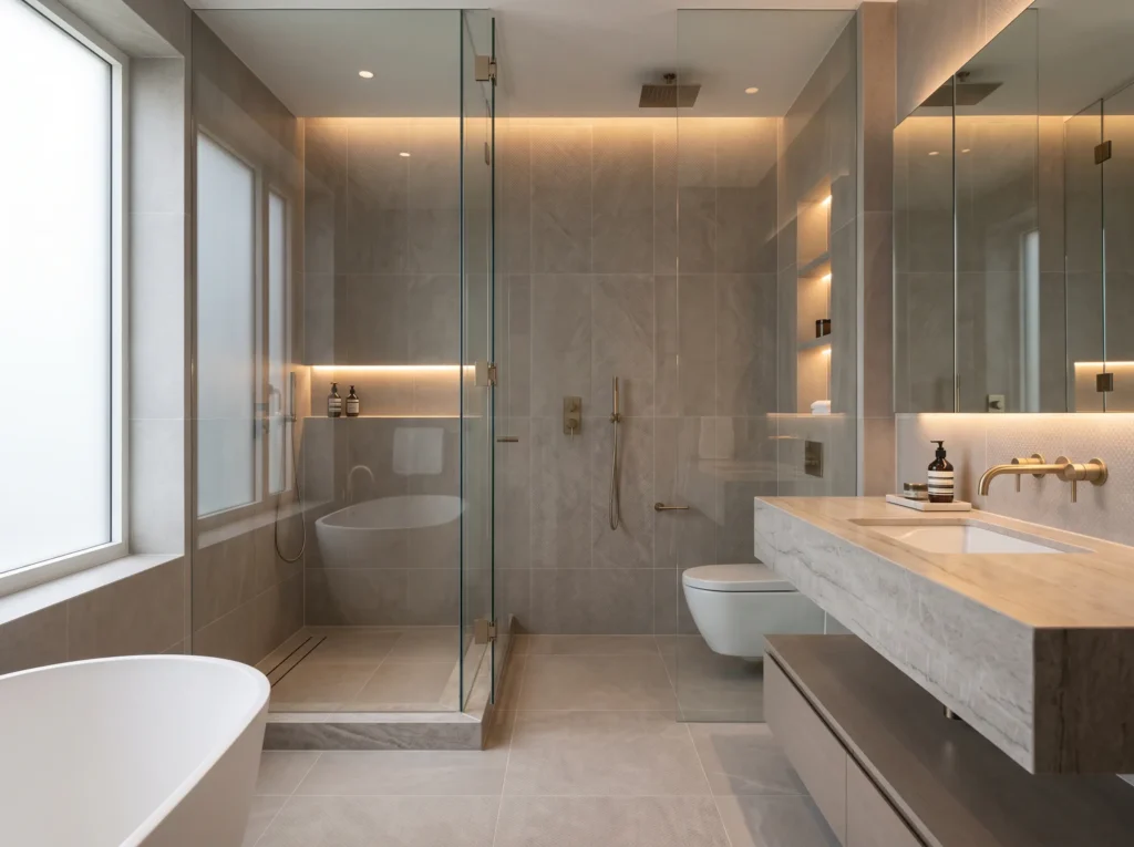
Extending tile to the ceiling removes that interruption. The room reads as a single unified surface. In a compact bathroom, this makes a meaningful spatial difference — not just aesthetically, but perceptually. The space feels larger because there is no visual stopping point pulling the eye back down.
Taking this further: extending the bathroom floor tile into a curbless shower floor and continuing it up a feature wall creates a surface continuity that is the defining characteristic of the wet-room aesthetic. No curb means no visual barrier between the room and the shower. The plane of the floor simply continues, and the bathroom reads as a single architectural volume rather than a room with a shower stuck in the corner.
Installation Mistakes That Undermine Even Good Tile
This is the part of the conversation that does not happen often enough before work begins. Good tile, badly installed, looks worse than budget tile installed with precision. The material is not what people remember — they remember whether the surface looks flat, whether the cuts look intentional, whether the whole thing holds up at close range.
Three problems account for most of the damage:
- Lippage from an unlevel substrate: Lippage is when adjacent tiles sit at slightly different heights, leaving raised edges that catch light and feel rough underfoot or against the hand. It usually happens because the substrate was not properly leveled before installation started. Requiring the use of a tile leveling system — clips and wedges that hold tiles at a consistent plane while the mortar cures — is the practical fix. It is not expensive to specify. It is just a conversation that needs to happen before the first tile goes down.
- Sliver cuts at the perimeter: Starting a tile run against one wall without planning the layout first almost always produces a thin sliver of cut tile at the opposite end. It looks unfinished and draws the eye immediately. The right approach is to dry-lay the tiles first, centering the layout so cuts at both ends are balanced and substantial. A forty-percent cut on both sides reads as intentional. A two-inch sliver on one side reads as a mistake.
- Warpage exaggerated by the wrong offset: Large-format rectangular tiles, especially plank formats, often have a subtle natural bow. When installed at a fifty-percent offset, the high crown of one tile sits directly adjacent to the lowest point of the next, which makes the warpage visible as lippage. Dropping to a one-third or twenty-five-percent offset keeps the joins between tiles in the flatter zone of each piece, and the surface stays uniform. This is something most homeowners never hear until after the problem is already installed.
The Last Decision Most People Make Too Late
Everything above — the layout, the grout, the edge treatment, the built-in details — works as a system. The mistake is treating these decisions as sequential rather than simultaneous. Grout color should be selected when tile is selected, not after installation, when it is effectively too late to reconsider without significant cost. Edge profiles should be specified before the tile order is placed, so the installer knows what they are working toward. The ledge cap material should be sourced before the framing goes up.
A bathroom that reads as genuinely custom is almost always one where someone thought through the finished room before a single measurement was made. The planning is the craft. The installation is just execution.
Sources
- Livingetc – Designer Tile Layouts and Bathroom Trends
- Houzz – High-End Bathroom Tile and Grout Design Guides
- The Tile Shop – Tile Patterns, Finishes, and Grout Guides
- Clé Tile – Architectural Layouts, Zellige, and Edge Trim Strategies
- TileBar – Subway Tile Patterns, Rectified Porcelain, and Installation Advice
- Country Floors – Natural Stone Liners and Herringbone Patterns
- Block Renovation – Modern Bathroom Remodel Guides and Ledge Details
Quick Comparison
| Layout Style | Pattern Geometry | Primary Visual Impact | Ideal Placement & Format |
|---|---|---|---|
| Vertical Stacked Bond | Tiles aligned directly in continuous vertical columns | Draws the eye upward to create the perception of higher ceilings | Compact shower stalls and narrow powder rooms |
| Herringbone | Tiles set at forty-five-degree angles in a repeating V | Introduces dynamic movement, depth, and a high-craft focal point | Shower feature walls and floor insets |
| One-Third Offset | Tiles staggered at one-third intervals instead of halfway | Creates a softer brick rhythm and minimizes visible tile warpage | Longer rectangular formats and plank-style tiles |
Frequently Asked Questions
Why should you use a one-third offset instead of a 50-percent brick pattern?
A one-third offset prevents excessive lippage on longer rectangular and plank tiles. Because longer tiles often have a slight natural bow from firing, a standard 50-percent stagger aligns the highest crown of one tile with the lowest point of its neighbor. Dropping to a one-third or 25-percent offset joins tiles where they are naturally flatter, maintaining a smooth, even surface.
What is the benefit of specifying rectified tiles?
Rectified tiles are mechanically cut after firing to create perfectly square, precise edges with uniform dimensions. This precision allows installers to set grout lines as narrow as one-sixteenth of an inch rather than the standard three-sixteenths. The result is a razor-thin joint that mimics high-end natural stone slabs and creates a cohesive, monolithic plane.
Should bathroom grout match the tile or contrast with it?
Tone-on-tone matching creates a calm, seamless surface where individual tile borders disappear, emulating the look of large-format architectural stone. High-contrast grout emphasizes the geometric grid and can look striking, but matching tones deliver a more timeless, spa-like atmosphere. Matching also conceals slight manufacturing color variations across tile bodies.
What is the most refined way to finish tile edges on outside corners?
A mitered edge is the most refined treatment because both tiles are cut at 45-degree angles to meet flush without external trim. If mitering is not feasible due to installer skill or tile thickness, a low-profile metal profile in a finish matching your plumbing hardware is the next best alternative. In transitional or traditional spaces, a marble pencil liner provides a handsome third option that introduces real stone texture as a datum line.
Why are continuous shower ledges preferred over recessed niches?
Continuous ledges run the full length of a shower wall, providing ample storage while avoiding the visual clutter of bottles concentrated inside a recessed box. Capping the ledge with a solid slab of stone eliminates grout joints on the horizontal surface where water tends to pool. It also allows you to echo your vanity countertop material inside the shower for cohesive material continuity.
How does extending tile to the ceiling make a bathroom feel larger?
Stopping tile midway up a wall creates a visual border that interrupts sightlines and segments the room. Carrying tile all the way to the ceiling eliminates that stopping point, drawing the eye upward and making walls feel taller. When paired with curbless shower flooring, full-height tile transforms the bathroom into a unified, open architectural volume.
