
Layering prints into a shared living space often feels risky. Most people worry that vibrant motifs will turn a relaxing room into visual chaos.
You can mix patterns while preserving an atmosphere of deep rest. The trick lies in balance, shared undertones, and controlled scale. When you treat prints as background harmony rather than competing accents, the entire room settles down.
A serene room never requires sterile surfaces. Quiet prints add warmth, depth, and character that flat walls simply cannot match.
Foundational Guidelines for Balancing Pattern and Serenity
Designers do not guess when they combine fabrics. They rely on clear structural guidelines to keep prints from fighting each other.
Unify Your Palette with a Shared Color Thread
Color acts as the primary anchor across different prints. Pick two or three quiet shades before buying any pillow or wallpaper.
What happens when every print shares a single background tone? The eye reads the entire collection as one cohesive story instead of noisy clutter.
Vary Motif Scale to Prevent Eye Strain
Visual fatigue sets in when adjacent prints share the exact same size. Stacking two medium-scale prints together forces them to compete for attention.
Build a deliberate scale hierarchy across your seating area:
- Large-scale prints: Anchor primary surfaces like woven area rugs, tailored drapery panels, or a statement armchair.
- Medium-scale prints: Cover secondary pieces such as standard accent cushions or tailored Roman shades.
- Small-scale micro-prints: Detail close-up items like lumbar cushions, ottoman welting, or pleated lamp shades.
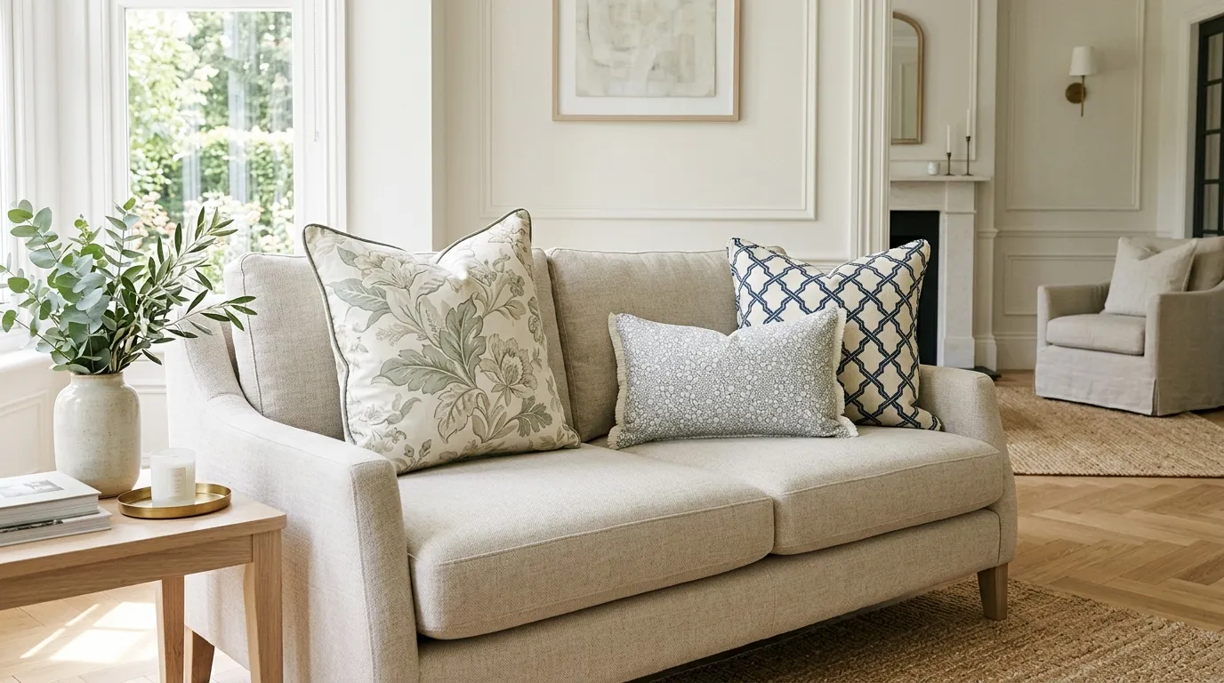
Lean into Quiet Tone-on-Tone Textures
High-contrast graphics, such as stark black-and-white prints, create visual tension that shatters a restful mood. They demand immediate attention.
Instead, choose tone-on-tone prints that keep foreground and background within the same shade family. Soft cream damask on oatmeal linen creates rich depth without raising the volume.
Use Tailored Stripes as Visual Breathing Room
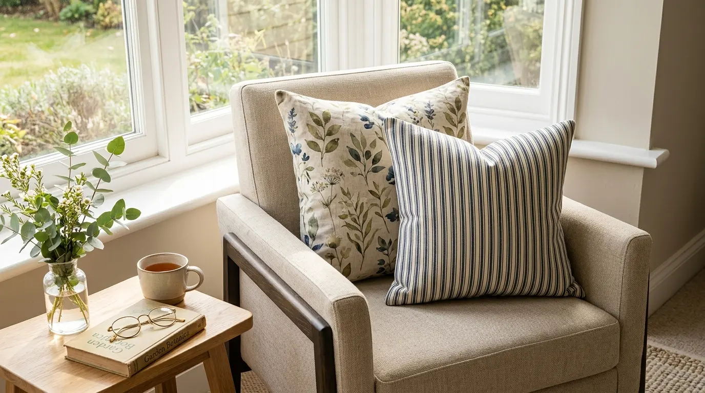
Linear prints function like neutrals in a styled room. Classic ticking stripes and neat pinstripes provide an orderly rhythm that calms fluid florals.
In practice, pairing a loose botanical print with a crisp stripe keeps the floral motif from feeling messy.
Protect Negative Space with Solid Blocks of Color
Prints need unpatterned space around them to breathe.
Keep at least 70 percent of the living room dedicated to solids, warm woods, and plain surfaces. A solid sofa cushions the eye, giving your gaze a place to rest.
Using Texture to Build Depth Without Print
Hesitant to commit to printed fabric? You can replicate the visual interest of pattern entirely through woven textures.
Tactile surfaces catch light and create natural shadow lines across the room. You gain rhythmic repetition without introducing extra dye or print.
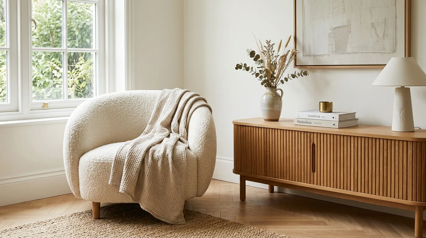
- Tactile upholstery fabrics: Nubby wool, washed Belgian linen, boucle, and waffle throws add dimension under natural daylight.
- Woodwork and paneling: Fluted cabinet doors, beadboard, and delicate picture frame moldings establish clean structural lines.
- Raw architectural materials: Herringbone oak floors, ribbed stone lamp bases, and caned cabinet inserts ground the space naturally.
Styling Pitfalls That Create Restless Spaces
When a patterned room feels chaotic, the mistake usually traces back to basic layout flaws. Fixing these details brings instant calm back to your lounge.
Competing Focal Statements
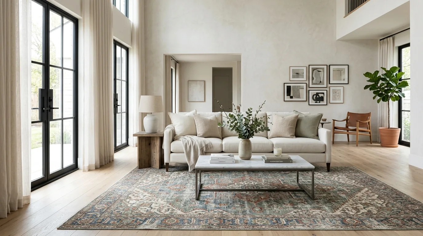
A living room can only handle one dominant patterned star. The reality is simple: two loud prints in one view always clash.
If your vintage rug features an intricate Persian weave, keep your sofa fabric solid. Choose simple drapery that steps back.
Clashing Undertones Under Artificial Light
Motifs can feature diverse shapes, but their underlying temperatures must agree. Mixing icy blue grays with buttery warm creams creates subtle tension.
One detail most people overlook is the evening lighting. Always check fabric swatches together under warm evening lamps before buying yardage.
Crowding Pattern into a Single Corner
Piling every patterned pillow onto one sofa creates an awkward visual anchor. It weighs down that corner of the room.
Spread pattern across the room in a gentle triangle. Try a print on the sofa, a coordinating cushion opposite, and a patterned throw nearby.
A Step-by-Step Method for Layering Calming Motifs
You do not need to style the entire room in a single weekend. Layer motifs slowly so you can evaluate the visual weight at each step.
- Establish your foundation: Keep your main sofa, wall paint, and largest furniture pieces neutral and quiet.
- Choose one primary pattern: Pick a hero fabric you love, such as a hand-knotted wool rug or muted botanical curtains.
- Pull accent shades: Extract two subtle background colors directly from your hero print to guide pillow selections.
- Introduce clean geometry: Add a ticking stripe or mini-grid cushion to steady the organic movement of your primary print.
- Step back and edit: Live with your pieces for a few days. If the room feels busy, pull one pillow out.
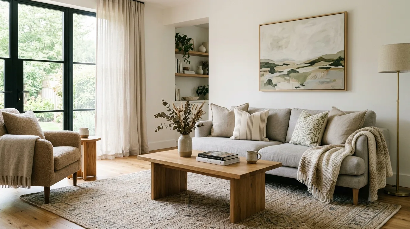
Final Thoughts on Peaceful Pattern Mixing
Creating a soothing living room never requires giving up pattern. It simply demands patient editing and respectful boundaries. When you anchor bold prints with generous solids and soft, tonal palettes, your living room becomes an inviting retreat filled with quiet character.
Sources
- Homes & Gardens – How to Mix Patterns in a Living Room
- Havenly – The Designer Guide to Mixing Patterns
- Laura U Design Collective – A Designer’s Guide to Mixing Patterns
- Decorilla – How to Mix Patterns in Interior Design
- Pamela Lynn Interiors – How to Mix Patterns Like a Pro
- Livingetc – Pattern Mixing Rules for Modern Living Rooms
Frequently Asked Questions
How much solid color should be in a patterned living room?
At least 70 percent of the living room should be reserved for solid fabrics, warm woods, and plain surfaces. Preserving generous negative space gives the eyes a place to rest and prevents layered patterns from feeling overwhelming.
How do you establish a scale hierarchy when mixing patterns?
Assign distinct motif sizes across different furniture tiers rather than grouping prints of identical sizes. Use large-scale prints on anchor surfaces like area rugs and drapery, medium-scale prints on accent pillows or window shades, and small micro-prints on close-up accents like lumbar cushions and lampshades.
What is the easiest way to make different prints look cohesive?
Unify the room around a shared color thread by selecting two or three quiet colors before purchasing textiles. When every patterned fabric shares a consistent background tone or undertone, the human eye perceives the room as a harmonious, curated collection rather than visual clutter.
Can you create visual interest in a room without printed fabric?
Yes, woven and architectural textures can replicate the depth and repetition of prints without adding dye or graphic motifs. Tactile elements such as bouclé, washed linen, fluted millwork, and herringbone flooring catch natural light to form subtle shadow lines that enliven neutral surfaces.
Where should patterned accents be placed to prevent visual imbalance?
Distribute patterned pieces in a gentle triangle across the room instead of clustering them in a single corner. Spreading accents across the sofa, an opposing accent chair, and a nearby throw disperses visual weight evenly throughout the living space.
