
Stark gray walls and clinical white trim are finally fading out of modern homes. People want living rooms that feel like a sanctuary, not a photo studio. Soft beige, warm greige, and rich earthy tones bring immediate comfort to shared spaces.
A neutral room does not have to feel sterile or plain. When you mix warm paint undertones with natural timber and layered fabrics, the entire atmosphere softens. Family and guests relax the moment they sit down.
How Warm Colors Relax the Mind and Encourage Connection
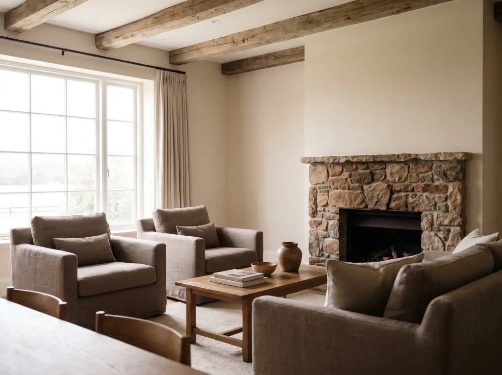
Color choices shift mood faster than any other design element. Shades with yellow, red, or soft brown undertones mirror elements in nature, like warm sunlight, weathered stone, and natural timber. These familiar tones signal safety to our subconscious mind.
Creating a Space for Conversation Without Overstimulation
Vibrant colors like scarlet or bright orange energize a space, but they quickly tire the eyes. Cool blues can feel quiet, yet they often feel distant or chilly. Warm neutrals strike an ideal balance. They make seating areas feel welcoming for conversation while keeping the room calm after a long workday.
Lowering Visual Noise to Help You Unwind
High contrast forces your brain to work harder as it scans a room. Low-contrast palettes remove that visual tension. When your background is soft and cohesive, visual clutter drops. The room shifts focus away from the walls and onto the people in it.
The Real Reasons Earthy Palettes Make Rooms Feel Welcoming
Designing a warm space takes more than picking a beige swatch. Earthy neutral palettes work because they soften sharp architectural edges and create a quiet backdrop for natural materials.
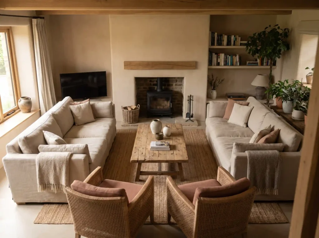
- Softening Hard Sunlight: Pure white walls bounce daylight harshly, creating cold shadows. Warm undertones diffuse natural light evenly, keeping the room soft throughout the day.
- Grounding the Layout: Tones like taupe and muted greige provide a feeling of permanent stability. They create a solid base that outlasts changing decor trends.
- Highlighting Organic Architecture: Neutral backdrops make exposed timber beams, brick hearths, and stone fireplace surrounds stand out naturally without competing for attention.
Practical Ways to Layer a Warm Neutral Living Room
Without deliberate planning, a neutral palette can turn flat and lifeless. Success comes down to intentional color ratios, tactile material changes, and correct lighting warmth.
Applying the 80/20 Rule for Visual Depth
To keep the room balanced, allocate 80 percent of your space to foundational warm neutrals. This includes wall paint, large sofas, and main area rugs. Use the remaining 20 percent for deeper accent tones.
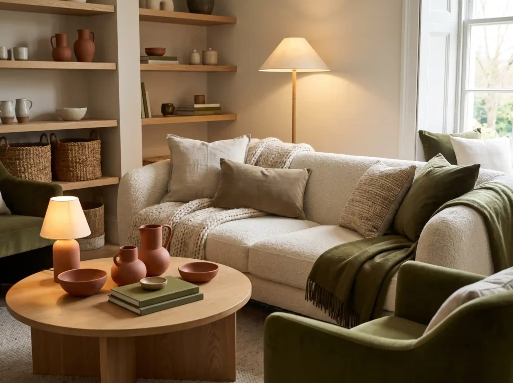
In practice, rich espresso wood, dark charcoal accents, olive green pillows, or terracotta ceramics supply the contrast needed to anchor the space. Without that 20 percent accent contrast, beige living rooms feel washed out.
Mixing Textures to Replace Bold Patterns
When color contrast is low, texture does the heavy lifting. Combining different tactile surfaces prevents monochrome rooms from feeling flat:
- Woven Fabrics: Combine chunky bouclé or linen sofa upholstery with velvet pillows and heavy wool throw blankets.
- Natural Timbers: Bring in oiled oak or dark walnut coffee tables to add warmth and organic grain structure.
- Tactile Surfaces: Add matte ceramic vases, unpolished stone, and brushed brass fixtures for subtle shine and contrast.
Setting Color Temperature for Evening Warmth
Lighting completely alters how paint looks once the sun sets. Cool white LED bulbs above 4000K turn warm beige paint into a dull, muddy gray.
- Choose Warm Lighting: Use LED bulbs rated strictly between 2700K and 3000K. This warm white range highlights gold and red paint undertones without washing them out.
- Factor in Window Orientation: North-facing windows receive cool, blue daylight, so pick paint with pink or yellow undertones to cancel shadows. South-facing rooms get bright golden sunlight, where balanced greiges keep walls from looking overly yellow.
- Layer Ambient Light: Position table lamps and floor lamps alongside warm overhead fixtures to create soft pools of light across seating zones.
Tested Warm Neutral Paint Colors That Work
What most people overlook is how drastically paint changes across different walls in the same room. These proven shades maintain their character under changing sunlight:
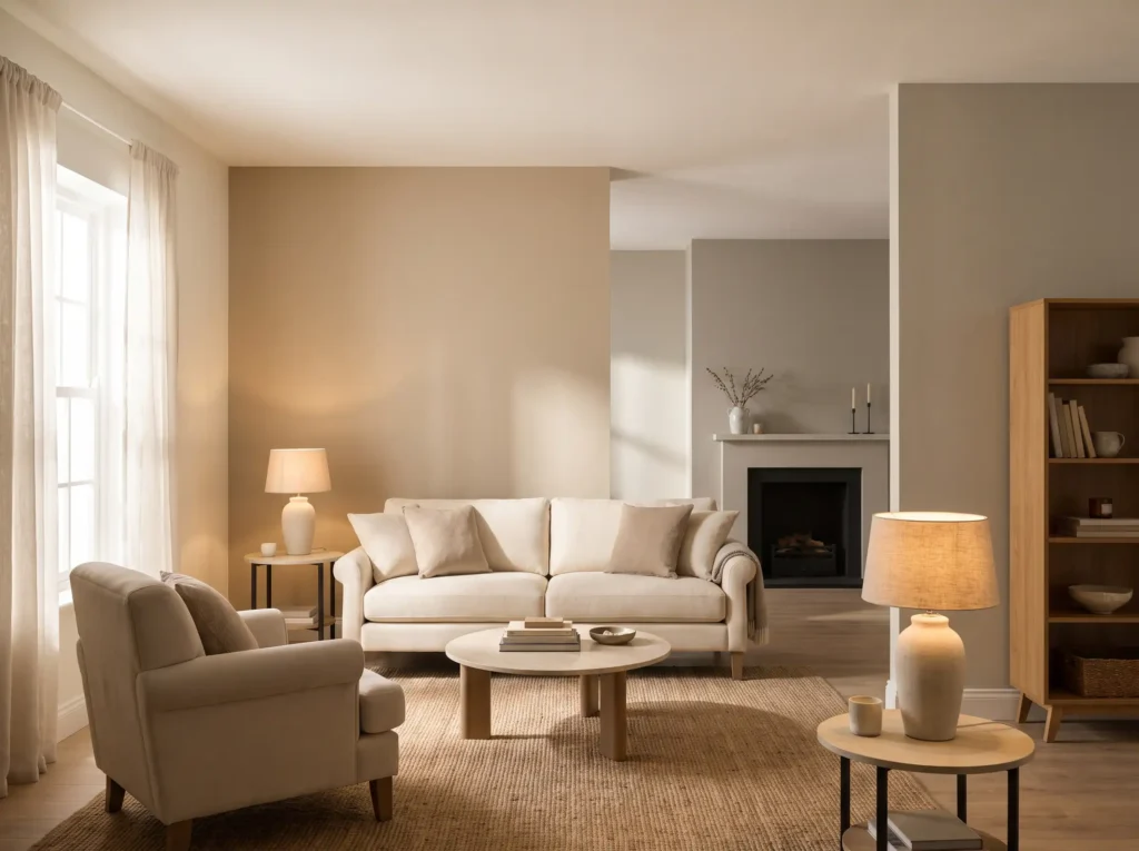
- Sherwin-Williams Accessible Beige (SW 7036): A versatile mix of gray and beige that adds warmth without feeling heavy.
- Sherwin-Williams Alabaster (SW 7008): A soft, creamy white that creates a glowing backdrop on walls and trim.
- Benjamin Moore Revere Pewter (HC-172): A classic greige shade that connects open floor plans with a calm tone.
- Benjamin Moore Edgecomb Gray (HC-173): A delicate gray-beige that shifts smoothly between natural daylight and evening lamps.
Mistakes That Can Make Neutral Rooms Look Dull
The mistake I see most often in neutral rooms is treating all light colors as interchangeable. Avoiding these missteps will keep your space cozy and inviting:
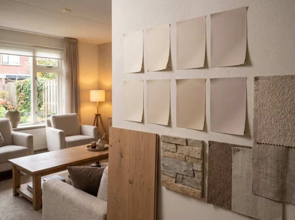
- Buying Paint in the Store: Never choose a wall color under store fluorescent lights. Store swatches look completely different on living room walls.
- Ignoring Fixed Undertones: Match your paint undertones against existing flooring, tile, and stone. Yellow-beige paint will clash instantly with pink-toned brick or cool gray tile.
- Relying on Smooth Surfaces: Combining smooth painted drywall with flat leather seating makes a room feel cold. Always add textural variation through fabrics and woods.
- Rushing the Evaluation Process: Test peel-and-stick paint samples on multiple walls. Observe them over three full days in morning light, afternoon sun, and night lighting.
Creating Your Own Inviting Living Room
Shifting your living room to a warm neutral palette is not about following a temporary trend. It is about creating an environment where your family feels grounded and comfortable every single day.
Start by testing two or three paint swatches against your trim and flooring. Once you pair the right undertones with soft 2700K lighting and textured fabrics, the room turns into your home’s favorite gathering spot.
Sources
- Willow Alexander — Living Room Color Psychology
- Clare Paint — Understanding Paint Undertones and Warm Neutrals
- Storeyboard Design — Avoiding Common Neutral Decorating Mistakes
- Samplize — Testing Neutral Paint Colors in Different Natural Light
- Sherwin-Williams — Warm Neutral Paint Color Collections
- Behr — Room Orientation and Light Temperature Guide
- Havenly — Interior Design Trends and Warm Neutral Palettes
- Funky Chunky Furniture — Layering Textures with Warm Neutrals
Quick Comparison
| Paint Color | Brand | Color Family | Key Characteristic |
|---|---|---|---|
| Sherwin-Williams Accessible Beige (SW 7036) | Sherwin-Williams | Beige / Gray-Beige | Versatile warmth without feeling heavy |
| Sherwin-Williams Alabaster (SW 7008) | Sherwin-Williams | Warm White | Soft, creamy glowing backdrop for walls and trim |
| Benjamin Moore Revere Pewter (HC-172) | Benjamin Moore | Greige | Classic greige that connects open floor plans |
| Benjamin Moore Edgecomb Gray (HC-173) | Benjamin Moore | Gray-Beige | Delicate shade shifting smoothly between daylight and lamps |
Frequently Asked Questions
What lighting temperature is best for warm neutral paint?
LED bulbs rated between 2700K and 3000K are ideal for warm neutral paint. This warm white range highlights gold and red paint undertones without washing them out, whereas cool white bulbs above 4000K can make warm beige look dull and muddy.
How does window orientation affect neutral paint colors?
Window direction impacts daylight warmth. North-facing windows bring cool, blue daylight that benefits from paint with yellow or pink undertones to cancel shadows, while south-facing rooms receive bright golden sunlight where balanced greiges prevent walls from looking overly yellow.
What is the 80/20 rule in neutral interior design?
The 80/20 rule allocates 80 percent of a room’s space to foundational warm neutrals like wall paint, sofas, and main area rugs, while reserving 20 percent for deeper accent tones like espresso wood, charcoal, olive green, or terracotta to provide necessary visual contrast.
Which warm neutral paint colors are recommended for living rooms?
Proven warm neutral shades include Sherwin-Williams Accessible Beige (SW 7036), Sherwin-Williams Alabaster (SW 7008), Benjamin Moore Revere Pewter (HC-172), and Benjamin Moore Edgecomb Gray (HC-173).
How do you prevent a neutral living room from feeling flat?
Combining varied textures prevents monochrome spaces from feeling flat. Mix woven fabrics like chunky bouclé or linen with velvet and wool, incorporate natural timbers like oak or walnut, and add tactile surfaces such as matte ceramics, unpolished stone, and brushed brass.
Why should you avoid choosing paint colors in the store?
Store swatches look drastically different under store fluorescent lighting than they do on living room walls. Paint colors should always be evaluated in your home using peel-and-stick samples across morning light, afternoon sun, and night lighting over three full days.
